Design systems · Accessibility · Cross-team collaboration
Post Office - Improving Consistency Through a Design System
Role: Product Designer · Timeline: ~2020–2022
The project focused on creating a scalable design system for the Post Office website while improving accessibility compliance and consistency across digital services.
View live website: postoffice.co.uk
The Post Office operates the UK’s largest retail network, with over 11,000 branches nationwide and more than 170 products and services, including banking, insurance, travel money and postal services.
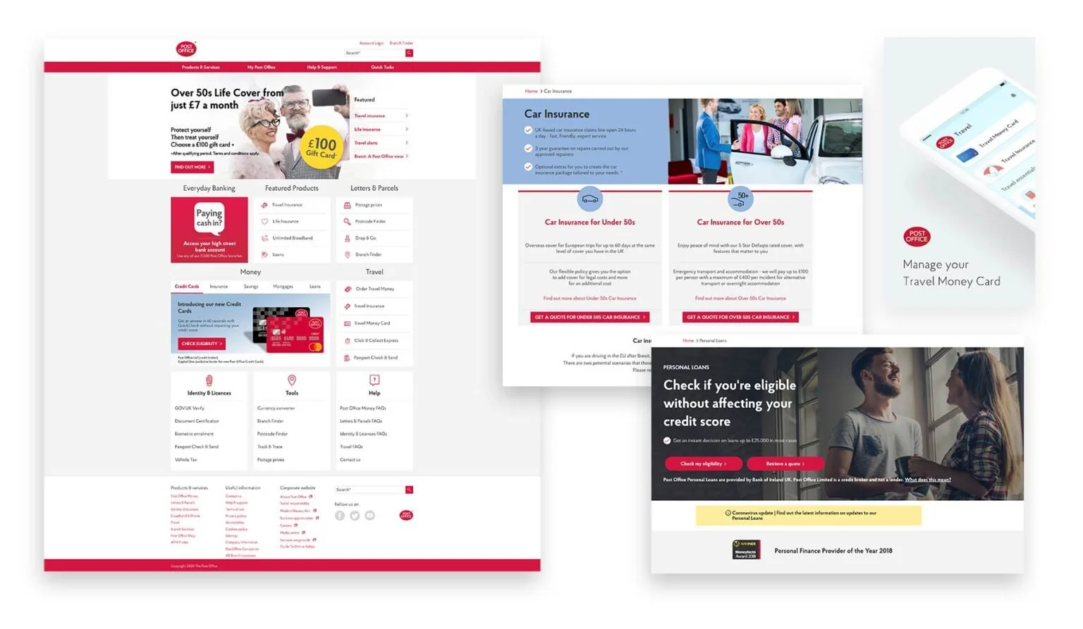
Over time, different teams and contractors had created UI patterns independently, resulting in inconsistent user interfaces, duplicated components and fragmented design libraries.
At the same time, organisations delivering public services were required to meet accessibility requirements under the Public Sector Bodies (Websites and Mobile Applications) Accessibility Regulations 2018, which align with the Web Content Accessibility Guidelines (WCAG).
“Designing accessible digital services has long been best practice, but the new regulations reinforced the need to formalise accessibility standards across the platform.”
Many existing components did not fully meet these accessibility standards.
The design team began exploring how a design system could help standardise components and support accessibility improvements across the website.
The problem
Several challenges existed across the product ecosystem:
inconsistent UI patterns across services
multiple variations of the same components
no single source of truth for design libraries or components
accessibility issues such as unclear focus states and inconsistent form behaviour
difficulty maintaining consistency between design and engineering teams
Without a shared system, teams often recreated components rather than reusing existing ones, increasing both design and development effort.
GOAL
The goal was to contribute to a scalable design system that:
improved consistency across the website
aligned components with accessibility best practices
supported collaboration between design and engineering teams
provided reusable components for future product development
The work also benchmarked accessibility patterns against the GOV.UK Design System, widely used across UK public sector digital services.
My Role
As a Product Designer, I contributed to the development of reusable UI components within the design system.
My work included:
auditing existing UI components across key services
designing accessible component patterns and states
collaborating with engineers to support implementation
contributing to documentation and usage guidelines
advocating for accessibility considerations in component design
The Process
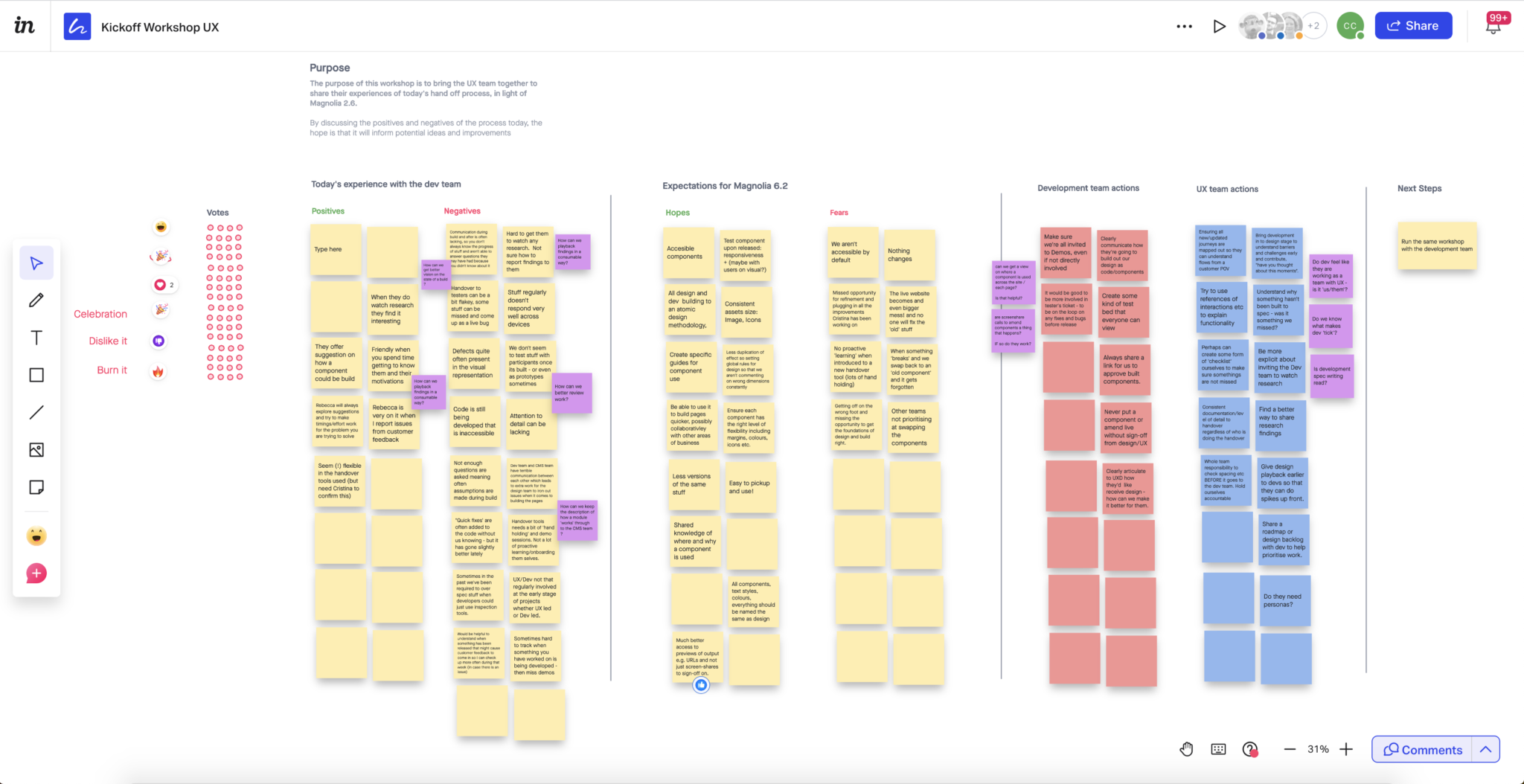
Kickoff & Alignment
To align design and engineering teams, we held a workshop to review existing workflows and identify pain points in the current design system process.
This helped establish a shared approach for auditing components and defining how new patterns would be designed and implemented collaboratively.
Component Audit
To understand the scale of inconsistencies, we reviewed existing UI patterns across the website.
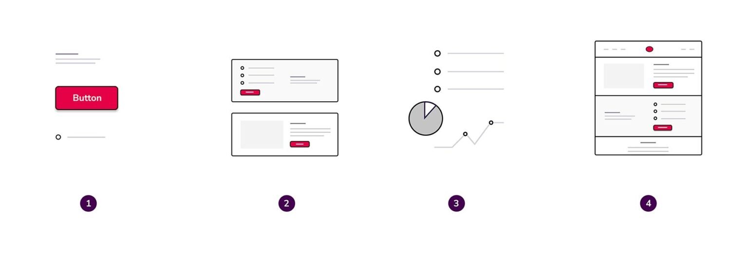
The audit included both foundational UI elements (atoms) and larger components.
Common issues included:
multiple button styles with different behaviours
inconsistent form validation patterns
missing or unclear focus states
variations in spacing and typography
The audit helped identify opportunities to consolidate and standardise components.
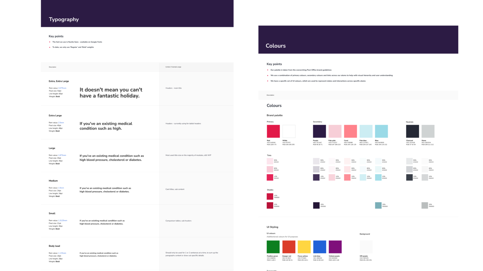
Designing Accessible Components
Each component was designed with accessibility in mind, including:
keyboard navigation
focus states
clear error messaging
semantic structure
consistent spacing and hierarchy
Components included clearly defined states such as:
Active
Error
Disabled
Default
Hover
Focus
This ensured both designers and developers could implement components consistently across services.
Collaboration with Engineering
Design system work required close collaboration with engineers to ensure components could be translated effectively into production code.
By aligning design and development patterns, the team worked towards a shared component library that could be reused across digital services.
The outcome
The design system helped support several improvements across the product ecosystem:
introduced reusable UI components across services
improved consistency across digital experiences
supported accessibility improvements aligned with WCAG guidelines
reduced duplicated design work across teams
enabled stronger collaboration between design and engineering
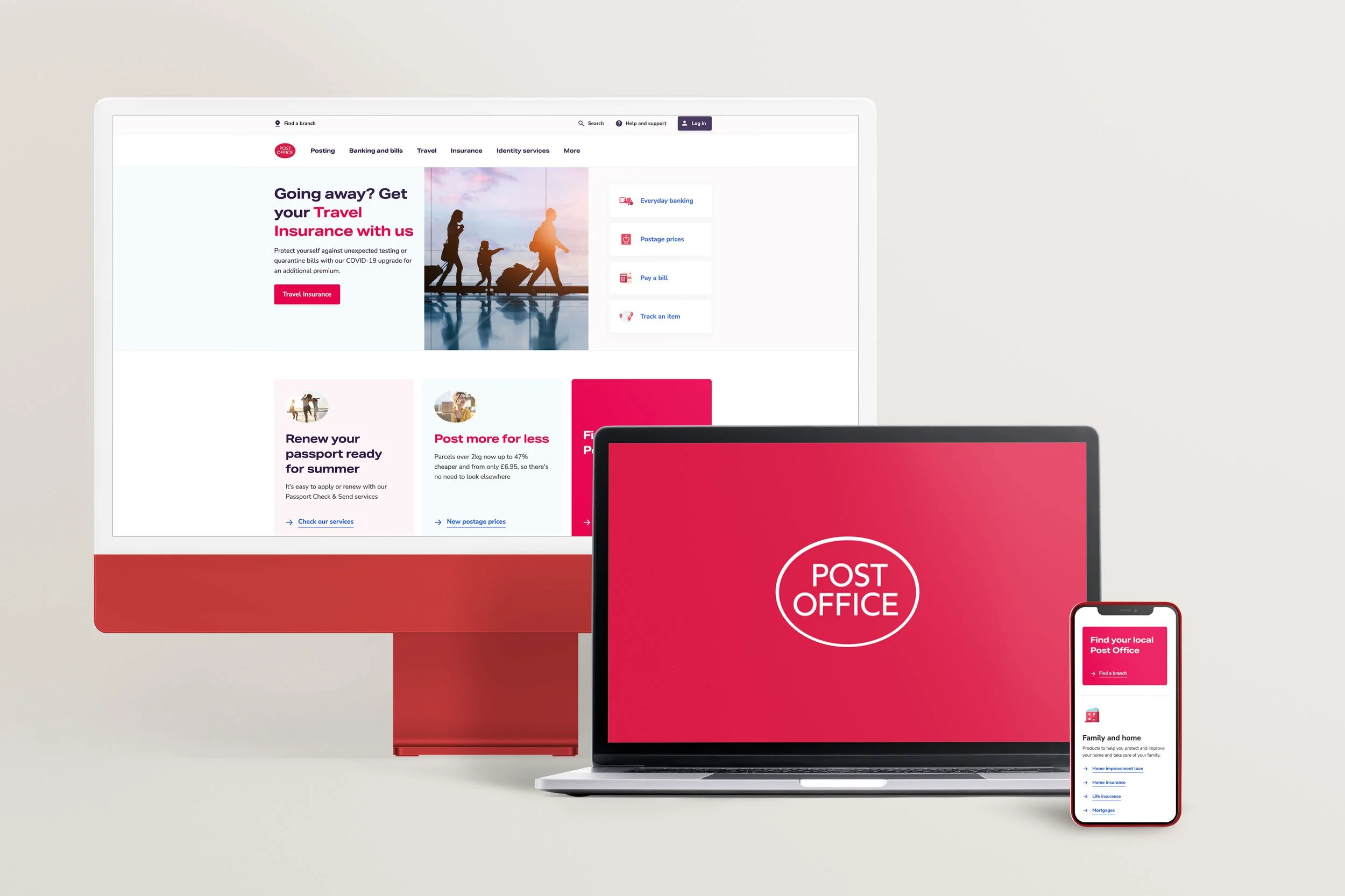
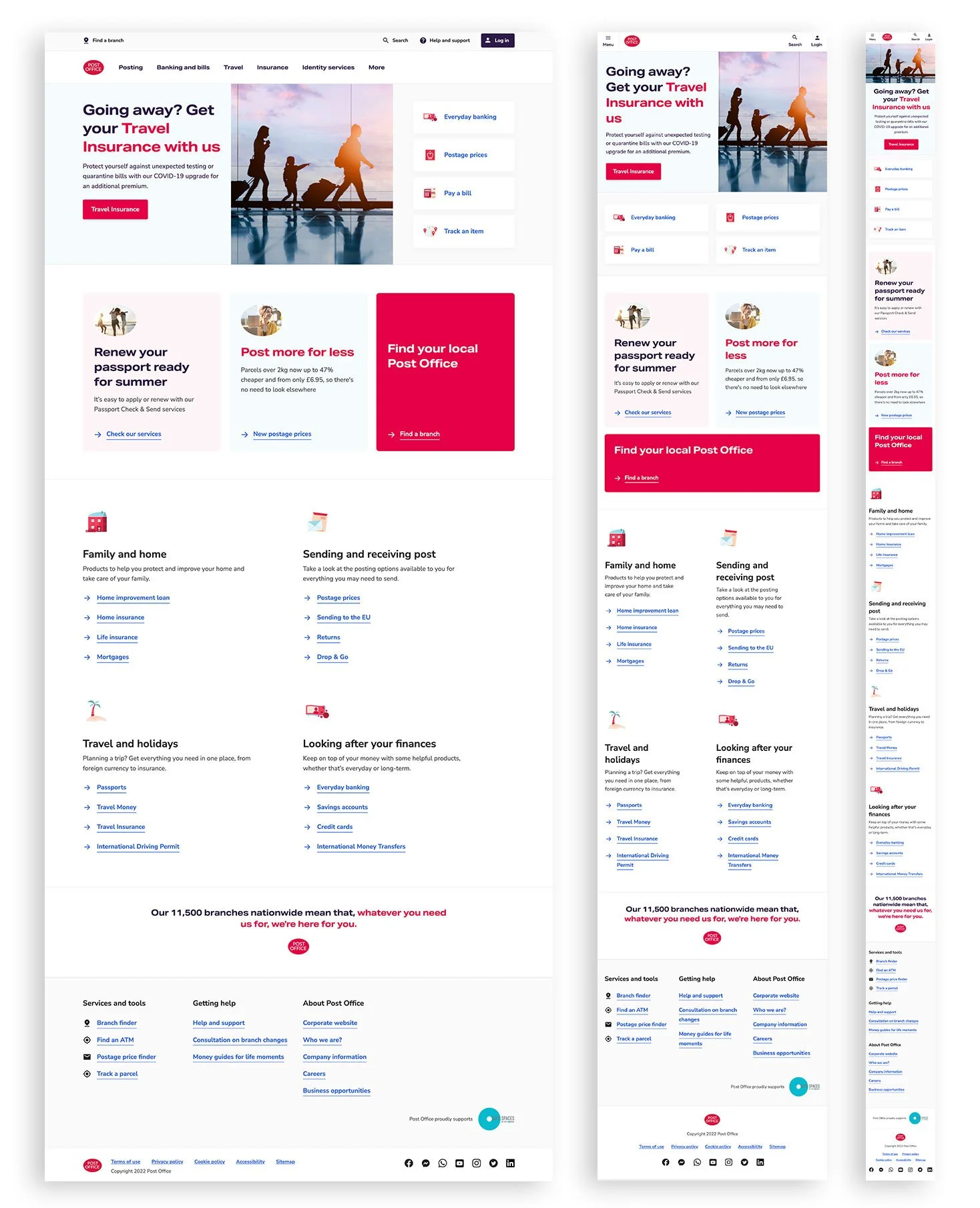
The first implementation of the design system was introduced through a redesigned homepage, which launched with updated navigation patterns, new promotional components and the refreshed Post Office brand.
Early observations suggested increased interaction with featured content and promotional components compared with the previous homepage carousel, which had limited visibility and accessibility.
Accessibility and performance improvements were also observed through tools such as Google Lighthouse, with further auditing planned as the system continued to evolve.
The design system continued evolving beyond the initial release as additional components and patterns were introduced across the platform.
key learnings
This project highlighted that successful design systems require more than just components.
Key learnings included:
adoption across teams is as important as the components themselves
accessibility needs to be integrated early into component design
close collaboration with engineering is essential for scalable systems
Impact
contributed to scalable design system foundations
improved accessibility alignment with WCAG standards
introduced reusable components across services
supported consistency across product teams
Adoption & Governance
For a design system to be effective, it needed to be adopted consistently across teams.
To support this, components were documented with clear usage guidance and shared with the wider product teams during refinement sessions. This helped ensure designers and engineers understood when and how to use components correctly.
Establishing a shared library created a single source of truth, reducing duplicated work and helping teams implement patterns more consistently across services.